In a Facebook comment Jason Finley suggested that I graph the logistic regression curves for each individual subject in order to identify outliers, etc., writing, "Thoughtful. Try also making a tiny plot for each subject and eyeballing the lot of them."
So I did that for 20 of the 64 subjects and here's what we get:
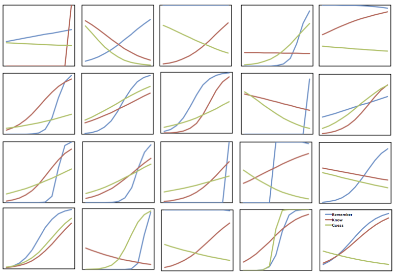
It's definitely a mess. Blue is remember, red is know, and green is guess (look here for a bit of background on the project). I'm staring at the plots trying to identify relationships and it isn't easy. Generally, the blue curves are highest to the right of the figures, suggesting that remember responses are more accurate than the other types when made at high confidence. And red is generally larger than green, too. But other than that, I'm at a loss.
The implication, then, is that there's a lot of variability within subjects in this procedure. My opinion is that an aggregated logistic regression equation, although valid for characterizing the overall relationship between confidence and accuracy as a function of remember, know, and guess, won't prove too useful on an individual level.